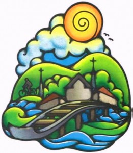
 This logo reflects the geographic and social characteristics of the City of Deux-Montagnes.
The two triangles represent the two mountains from which its name originates, namely the Calvaire Mountain and Saint-Joseph-du-Lac Hill. The wavy base at the bottom of each triangle is a reminder of the two waterways bordering Deux-Montagnes, namely Lake of Deux-Montagnes and the Mille-Îles River.
The overlapping triangles symbolize the exceptional community life and spirit of support that prevail on the territory. It’s also a recall of the close collaboration that exists between both of Deux-Montagnes linguistic communities, as 20% of its population is English-speaking while the other 80% is francophone.
The logo’s colours – green and blue – are an echo of Deux-Montagnes ecological vision and a reminder of one of the territory’s main attractions: nature. The green is for the Roger-Lemoine woodland, the trees, the bicycle path and the parks, the blue for the two waterways that border half the city.
 It consists of several key elements, namely, the two mountains; representing the valleys and name of the city. They make up the landscape background.
The two waterways that surround the city, the Milles-Iles River and the lake, are in the forefront. Then, the railroad track symbolizes the ascent to a greener future; it makes the city very accessible, open and inviting.
We can see houses too. The first house, with its dormer roof and window, winks at City Hall and shows our city’s architectural heritage. We also notice two bell-towers. Besides reminding us of our historical heritage, they bring to mind the two languages, the two cultures that live in harmony in Deux-Montagnes.
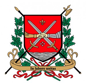
 The red background represents the blood shed at the beginning of the colony, commemorating the heroic history of our ancestors. The fleur-de-lys represents the francophone community, the silver rose represents the anglophone community, the silver undulating surface represents the shoreline of Lac des Deux-Montagnes, the spear and the halberd recall the bloody battles of 1837, the two crossed swords represent the struggles followed by a period of friendship between the two communities and the branches and maple leaves represent Canada. The handshake emphasizes the good will, while the motto “IN LABORE UNITAS” means Together for a Common Cause.


